Brussels Airlines gets a makeover and prepares for relaunch
A new logo, livery and completely redefined identity to relaunch itself after the pandemic in what is the [...]


 Star Alliance
A new logo, new livery and completely redefined identity to relaunch after the pandemic in what is the second phase of the plan called "Reboot Plus."
In this article:
The new identity Of the company fully controlled by the Lufthansa Group includes a new version of Brussels Airlines' signature colors: now the red will be deeper and the shade of blue darker.
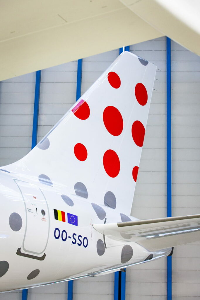
The dotted "b," which colors the tails of its fleet today, gives way to 9 dots of different sizes in the shape of a square. To represent the diversity of its customers, destinations and employees, no dot is the same.
What if your next trip was because of points?
Join the Training Center and improve your knowledge in the world of travel reward
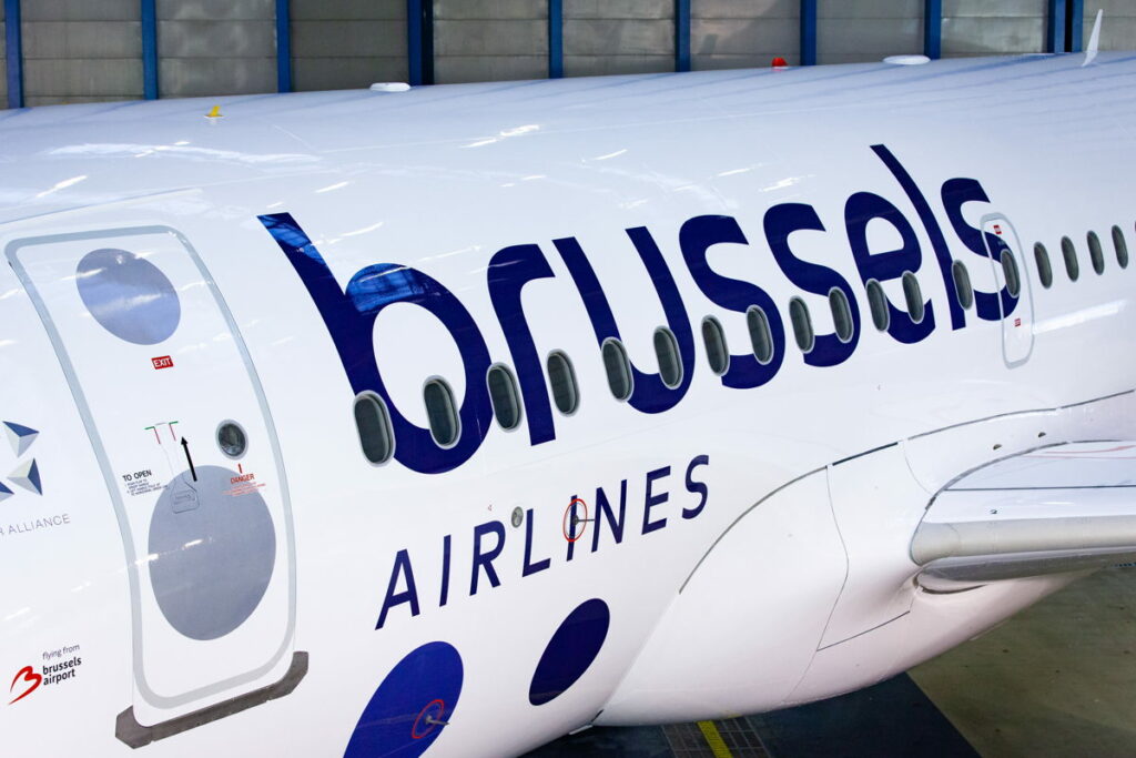
The updated logo also uses a new, more modern font. The two brand words are now superimposed and the word "Brussels" is larger in size, all to emphasize the airline's Belgian identity. The aircraft's new livery also shows a zoom on the dotted logo on the tails, a fresh white body and a continuation of dots in different shades of blue and gray.
The new identity
With this plan, an attempt to emancipate the company from the anonymity to which it is relegated in the German group is evident: "We want to clearly mark the beginning of the New Brussels Airlines. For our customers, who deserve the best, but also for our employees, who are committed to the transformation we are leading and to which they contribute every day - said Peter Gerber, CEO of Brussels Airlines - That's why today we present the visual translation of our new beginning. As one of the four airlines in the Lufthansa Group network, we are building the road to a promising future. We see this new brand identity as a symbol of confidence in our company, again emphasizing our identity as Belgium's home courier."
In conclusion
The logo is beautiful and modern, now we need to see if putty and paint will also be followed by a change in the quality of service and especially in the identity of a company that in recent years has always been considered the most unfortunate of the entire LH group.